Chromatic Whispers: Why Quiet Colour Is Becoming the Most Powerful Design Language
- Dec 24, 2025
- 3 min read
Updated: Feb 17
Chromatic Whispers explain how restraint, softness, and muted palettes are reshaping brand expression, longevity, and emotional trust
When Loud Stops Working
For decades, visual culture equated impact with intensity.
Bright colours, sharp contrasts, and maximalist aesthetics were treated as shortcuts to attention in crowded markets.
Today, that equation is breaking down. What once felt bold now feels abrasive, and what once signalled innovation now registers as noise.
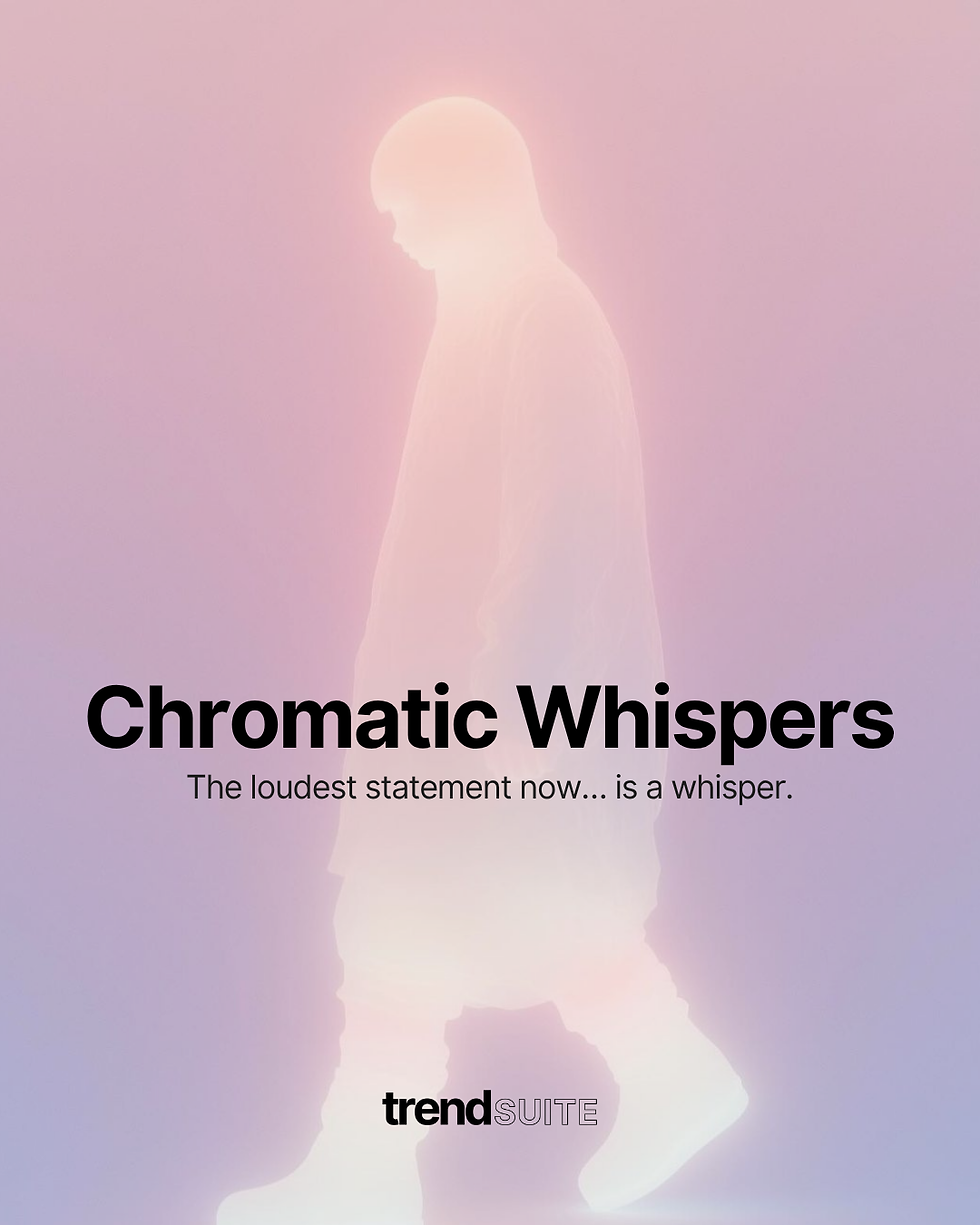
Chromatic Whispers describe a cultural shift away from spectacle and toward subtlety. In this new visual era, color no longer competes for attention. Instead, it earns attention through restraint, confidence, and emotional intelligence.
Quiet palettes offer calm in environments saturated with urgency.
From Visual Noise to Visual Care
At the core of Chromatic Whispers is a new palette logic.
Neon hues and hyper-saturation are giving way to softened greens, diffused metallics, sand-milk neutrals, and low-contrast tonal families.
These colours do not demand reaction.
They invite longer engagement and deeper perception.
This shift reflects a broader cultural need for visual care. As people prioritize mental wellbeing and emotional safety, they seek visual systems that feel breathable rather than aggressive. Muted palettes reduce cognitive load, slow consumption, and allow presence instead of pressure.
Chromatic Whispers and Brand Longevity
One of the most powerful effects of Chromatic Whispers is its relationship to time.
Loud colour trends burn fast, peak quickly, and date just as fast.
Quiet palettes age with grace.
Brands adopting desaturated tonal systems extend perceived longevity.
Products feel relevant for longer, campaigns resist trend fatigue, and visual systems build equity rather than chase novelty.
In uncertain times, calm colour communicates stability and suggests permanence rather than performance.
Storytelling Through Softness
Chromatic Whispers also reshape storytelling.
When colour steps back, narrative moves forward.
Products photographed in natural light feel more human, and spaces feel lived-in rather than staged.
Muted palettes make room for texture and materiality.
A fabric weave becomes expressive.
A surface imperfection becomes meaningful. Detail carries emotion. Meaning is no longer shouted; it is allowed to unfold.
Performance in the Attention Economy
High-contrast colour still creates short-term spikes, especially in fast-moving social feeds.
But performance tells a deeper story.
Brands see stronger conversion when visuals feel calm.
Retention improves when systems feel coherent.
Emotional recall lasts longer when palettes do not overwhelm. Chromatic Whispers do not interrupt attention — they resonate with it.
The Future Will Whisper
Chromatic Whispers are not about minimalism for its own sake.
They are about emotional alignment. In a volatile world, people gravitate toward brands that feel steady and intentional.
The palette of the future will not scream. It will hum with confidence.
It will whisper with clarity — and because of that, it will be heard more deeply than ever.
Innovator Elite Trend Membership
The industry is louder than ever—more noise, more trends, more content demanding your attention.
But great design has never come from chasing the feed.
Innovator Elite isn’t about keeping up.
It’s about seeing further.
Trusted by a global community of 3,000+ designers, innovators and brands, Innovator Elite delivers tomorrow’s ideas before they surface—turning instinct into intelligence, creativity into strategy and vision into confident action.
Because the brands who shape the future aren’t reactive.They design it.
Be the brand others study, emulate and admire.Lead with intent. Create with precision. Move ahead of the shift.
Your next chapter starts with clearer thinking, stronger direction and a creative advantage you can feel.
Explore Innovator Elite membership plans today and step into your full Trend Resource.


