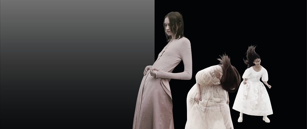
Colour sets the signal
Macro direction explains what is shifting. Colour is often the first place that shift becomes visible in a collection.
Before a customer understands the full concept, they read the palette. It sets the mood, sharpens the season and tells them whether the product feels new, relevant and worth paying attention to.
Trend Suite colour forecasts help you understand which tones are gaining relevance, how they connect to wider cultural shifts and how they can support stronger product decisions from the start.
Because colour is not the finishing touch.
It is one of the first signals of where the collection is going.
Not every colour deserves space.
Trend Suite colour forecasts edit the noise — connecting cultural shifts, consumer mood and product relevance to build palettes with purpose.
The result is colour direction that supports range balance, brand identity and seasonal newness before the collection is fully formed.
A stronger palette does more than decorate.
It tells the season where to go.


Inside a colour forecast
Not just colours. A system for using them.
Each Trend Suite colour forecast connects cultural context, palette structure and product application — helping you understand which shades deserve space, how they work together and where they make sense in the range.
Expect:
-
Core, accent and directional tones
-
Colour stories with seasonal intent
-
Product cues for applying colour across categories
Because a palette is only useful when you know what to do with it.
Find the right colour forecast


Ready to go deeper?
Explore individual forecasts
Shop directional reports by season and category — from macro trends, colour and print to swimwear, activewear, textiles, accessories and more.
Unlock full access with Innovator Elite
Get the full forecast library, new releases, CAD Suite and member-only direction in one place — built for brands that want the full view before they move.
Start with one report.
Or unlock the whole system.