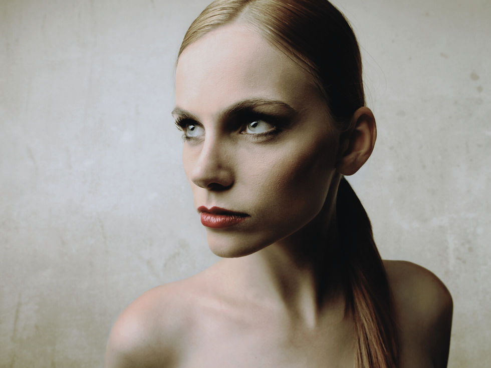
Autumn Winter 2027-28 Colour Forecast Women: The Structural Recalibration of Luxury
- Mar 4
- 3 min read
Updated: Mar 31
Why the Autumn Winter 2027-28 Colour Forecast Women Signals a Shift from Spectacle to Strategic Authority

Autumn Winter 2027–28 confirms a visible shift in how colour operates within fashion. After years defined by algorithm-driven brightness and short-cycle visual impact, palettes are consolidating. The appetite for novelty is cooling. What replaces it is not minimalism for its own sake, but composure.
Colour is no longer engineered for interruption. It is engineered for credibility.
Design teams are reducing chromatic volatility in favour of depth, mineral stability and tonal discipline. Collections built on visual chaos now read unstable. Cohesion reads intelligent.
Depth Becomes the Marker of Luxury
Across the season, saturation lowers while density increases. Pigments appear weightier — iron-toned neutrals, nocturnal blues, cultivated greens and reds with material gravity. Contrast is precise rather than loud. Tension exists, but it is controlled.
This reflects a recalibration in value perception. Consumers increasingly associate maturity with restraint. High-impact colour no longer guarantees relevance; it often signals disposability. Depth, on the other hand, signals investment.
Luxury is communicating through control.
Innovation Without Noise
The season does not reject modernity — it refines it. Luminosity appears in measured applications. Sheen is diffused. Colour gradients feel engineered rather than spontaneous. The influence of seamless technology is evident: performance is expected, but it should not announce itself.
The most progressive palettes of Autumn Winter 2027–28 feel intelligent without being theatrical. They stabilise the eye rather than overstimulate it.
This is sophistication through calibration.
Regeneration as Structural Logic
Environmental discourse has matured. The industry has moved beyond symbolic green coding toward systemic transformation.
Colour follows suit.
Greens are denser, almost cultivated. Earth tones appear oxidised, layered, processed. Reds deepen into visceral registers that suggest material truth rather than cosmetic application.
The palette reflects process, not marketing.
Cohesion as Competitive Advantage
The defining strength of the season lies in architecture. When colour is built as a system — not selected as isolated statements — it strengthens brand equity. It sharpens retail presence. It improves longevity across drops and digital environments.
In an oversaturated market, clarity wins.

Frequently Asked Questions
What defines the autumn winter 2027–28 colour forecast women?
A structural shift from visual spectacle to chromatic discipline. Depth, cohesion and controlled contrast replace novelty and algorithmic brightness.
How should brands apply it?
Anchor ranges in mineral bases and controlled neutrals. Introduce tension deliberately. Prioritise palette cohesion across categories rather than hero shades that fragment the collection.
Is bold colour obsolete?
No — but it is strategic. High-saturation tones act as punctuation, not foundation.
Why is regeneration influencing colour so strongly?
Because consumers now evaluate systems, not slogans. Pigment must align with credible material logic.
Final Perspective
Autumn Winter 2027–28 makes one thing clear: colour can no longer afford to be impulsive.
It must justify its presence.
It must reinforce structure.It must build authority.
Brands that understand this shift will design with longevity. Those that ignore it will continue chasing visibility.
Colour is no longer decoration. It is position.
—Trend Suite
Want a clearer way to use Trend Intelligence (without the noise)?
If you’re new here (or you’re rebuilding your process), start with the Trend Toolkit + Forecast Previews hub. It’s designed to take you from inspiration to decisions — quickly, and with intent.
Step 1 — Start here (overview + how it works):
This page explains what the Toolkit is, what the previews show, and how to choose the smartest next step.
→ Visit the Toolkit + Previews page: Start Here
Step 2 — Download the Toolkit (free):
A practical framework you can apply immediately to sharpen your direction and build a stronger seasonal point of view.
→ Download the Trend Toolkit: Free Toolkit
Step 3 — Explore the previews (see the depth before you buy):
These previews show the structure, clarity and application inside Trend Suite forecasts — so you can choose with confidence.
→ Colour Forecast Preview: Colour Forecast Preview
→ Macro Trend Preview: Macro Forecast Preview
→ Swimwear Forecast Preview: Swimwear Forecast Preview
In a market moving at algorithm speed, the brands that win aren’t the ones chasing trends — they’re the ones translating signals into clear, commercial decisions early.