Colour Is Getting Quieter: The Shift Most Brands Will Miss
- Apr 15
- 3 min read
Updated: Apr 16
A cultural signal is emerging: colour is becoming more controlled, reduced and strategically expressive.

Colour is often interpreted through trend cycles — brights vs neutrals, warm vs cool, maximal vs minimal. But the current shift is not simply aesthetic preference. It reflects a deeper recalibration in how visual information is processed and valued.
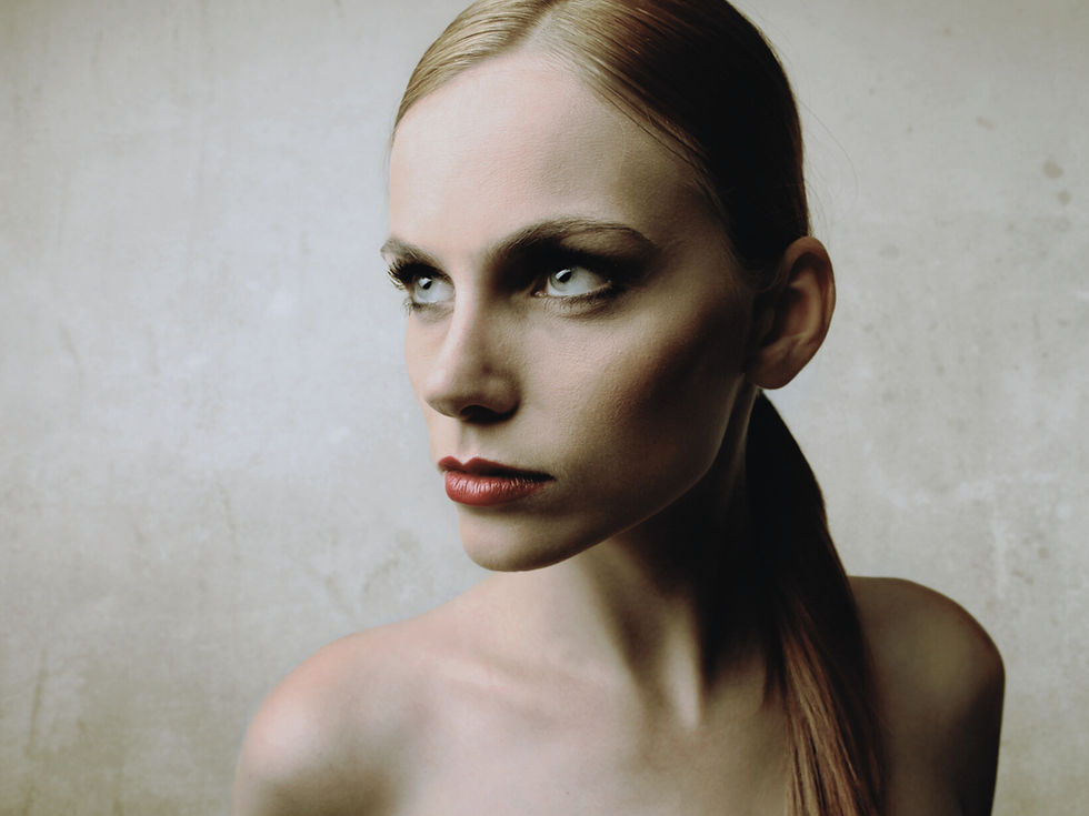
Across fashion, colour is becoming more restrained, more precise and more deliberate in its impact. Not softer in a decorative sense, but more controlled in how it communicates meaning.
This movement signals a wider cultural adjustment. As visual environments become increasingly saturated, clarity becomes more valuable than intensity.
Reduced contrast signals a shift in visual culture
High contrast colour combinations traditionally function to capture attention quickly. They operate effectively in fast-moving environments driven by immediacy and rapid consumption.
However, an alternative direction is gaining relevance. Fogged transitions, softened tonal shifts and lower contrast palettes are appearing with increasing frequency across collections. The result is colour that feels less declarative and more atmospheric.
This does not reduce impact. It changes the pace at which colour is understood.
Subtlety encourages closer attention. It invites longer engagement. It communicates confidence through control rather than intensity.

Grey is evolving from neutral to structural colour
Neutrals are no longer functioning purely as background. Tones such as mineral greys, softened charcoals and muted industrial hues are becoming more central to how collections communicate authority and refinement.
Grey increasingly operates as a structural colour. It carries material weight, sharpens silhouette perception and supports garments where proportion or fabrication require composure rather than distraction.
Rather than simply balancing brighter colours, these tones often become the foundation of the palette itself.
Blue is shifting towards system-led expression
Blues are also evolving. Rather than classic navy or decorative mid-tones, more atmospheric variations are emerging. Slightly desaturated, technical or mineral-based blues communicate precision and intelligence.
These tones often appear in materials that enhance their effect — structured cottons, coated finishes, technical blends and controlled matte surfaces.
Blue begins to signal reliability, calibration and design intention.
The shift is less about colour and more about control
Across palettes, a common direction emerges: colour is becoming more considered. Reduced noise, refined transitions and controlled saturation suggest a move towards visual intelligence rather than visual excess.
This reflects a broader cultural desire for clarity within increasingly complex environments.
Colour becomes quieter, but more strategic.
Brands that recognise this early are able to build palettes that feel resolved rather than reactive.
Need the full direction behind this shift??
Understanding how colour behaviour evolves is essential for building collections that feel current at launch, not outdated by the time they reach market.
The strongest brands do not wait for colour shifts to become obvious. They move when signals are still forming.

Shop the full Forecast
Access the complete AW27–28 colour direction, including macro drivers, palette architecture and deeper seasonal insight designed to support collection development.
Need wider access across the season? Join Innovator Elite.
Innovator Elite gives you full access to Trend Suite’s forecast library across seasons, categories and design direction — so you can build with stronger visibility on the shifts shaping colour, product and brand recognition over time.

Join Innovator Elite
Unlock full access to the complete Trend Suite forecast library across seasons, categories and design direction.
Innovator Elite is designed for brands developing multiple collections, providing continuous visibility of emerging shifts across colour, silhouette, materials and consumer behaviour.
All new releases are included throughout membership, supporting confident long-term planning.
Not ready to explore full forecasts yet?
Download the free Trend Toolkit for a practical introduction to how Trend Suite translates cultural shifts into clear product direction.

Start with a free AW27-28 Colour Guide
A concise edit of the five colour shifts shaping AW27–28 womenswear, designed to help brands identify the tones influencing next-season product and palette direction.
5 defining colour directions for AW27–28
A sharp edit for brands shaping next-season product
Free to download now