SS28 Colour Trends: Why Colour Is Becoming Fashion's Most Strategic Design Decision
SS28 colour trends reveal a shift beyond seasonal palettes, with colour increasingly shaping emotion, product identity and commercial differentiation across fashion collections
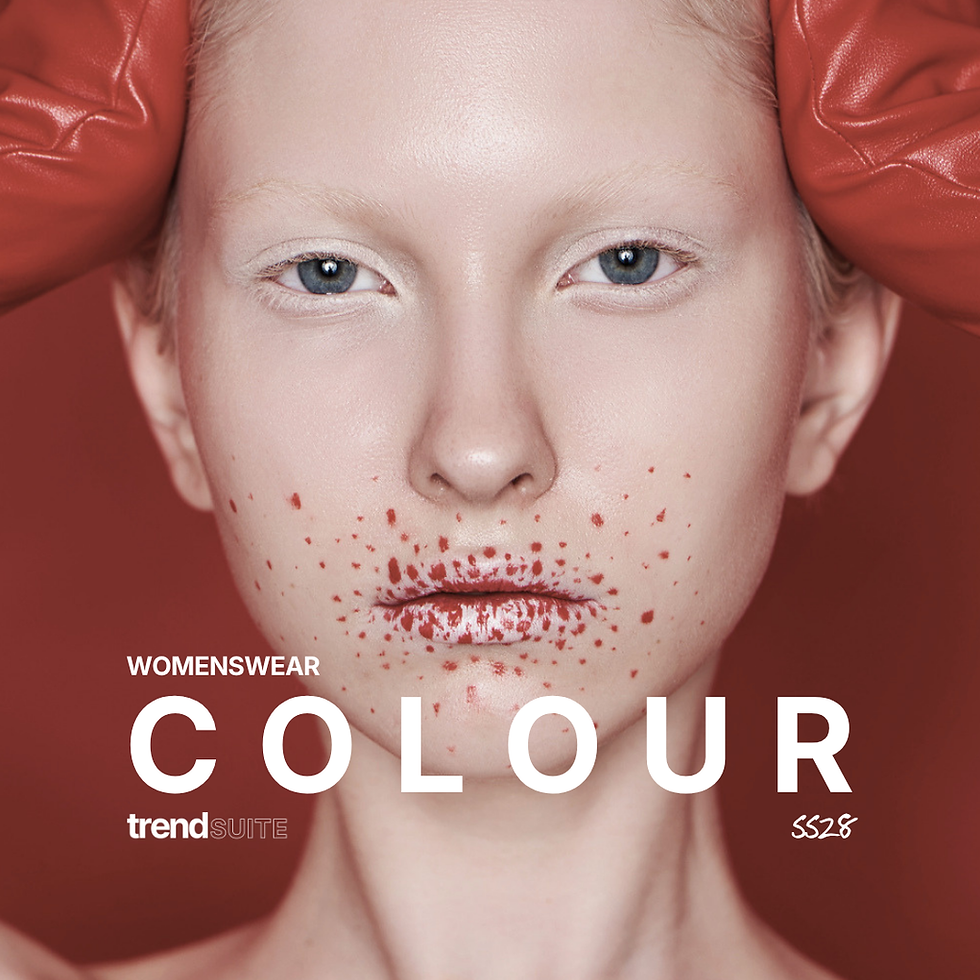
Every season begins with colour, yet it is often one of the last creative decisions to receive strategic attention. Silhouettes may generate headlines and materials may define tactile direction, but colour is what gives a collection its emotional rhythm. It is the first signal consumers register and the thread that connects products across categories. As fashion moves into Spring Summer 2028, colour is becoming less about introducing the next fashionable shade and more about expressing changing cultural values.
The most successful palettes are no longer selected because they feel new, but because they help brands communicate a clearer point of view.
This marks an important shift for product development. Consumers are surrounded by endless visual stimulus, making colour one of the fastest ways to establish recognition, mood and distinction. Rather than chasing novelty for its own sake, leading brands are using colour to reinforce identity, strengthen storytelling and build collections with greater longevity.
Colour is becoming a strategic design language
Fashion has traditionally treated colour as a seasonal update. Every six months, a fresh palette would emerge to signal change and encourage newness. While seasonal evolution remains important, the role of colour has become considerably more sophisticated. Colour is increasingly used to communicate permanence, optimism, protection, escapism or emotional restoration before a consumer even considers silhouette or fabrication.
This reflects wider cultural behaviour. Consumers are becoming more emotionally selective about the products they buy, gravitating towards colours that feel reassuring, uplifting or quietly distinctive rather than simply fashionable. The palette itself becomes part of the product's meaning, helping explain why two garments with identical construction can evoke completely different emotional responses.
For brands, this means colour should be considered from the beginning of the design process rather than applied at the end. The strongest collections allow colour, material and proportion to evolve together, creating products that feel coherent rather than assembled.

The strongest palettes create recognition, not noise
The pressure to introduce new colours every season has often resulted in collections that feel visually fragmented. Individual shades may appear interesting in isolation, yet struggle to create a consistent identity across the range. Increasingly, the most successful brands are moving in the opposite direction.
Rather than expanding palettes endlessly, they are editing more rigorously. Colours are selected for the relationships they create, the emotions they reinforce and the way they support multiple product categories. A restrained palette frequently produces greater impact because each shade is given room to establish meaning.
This is particularly relevant as consumers become more discerning. Recognition is no longer created through logos alone. Colour itself has become a powerful branding device, helping products feel immediately identifiable while strengthening long-term visual consistency.
Cultural shifts are reshaping colour preferences
Colour does not exist independently of culture. Economic uncertainty, technological acceleration, environmental awareness and changing definitions of luxury all influence the colours consumers respond to. As society changes, palettes evolve alongside it.
Some colours offer a sense of stability and permanence. Others encourage play, optimism or experimentation. Certain combinations feel digitally influenced, while others reconnect consumers with materiality and tactility. These emotional associations often become more significant than the colours themselves.
Understanding these underlying drivers allows design teams to make stronger decisions. Rather than reacting to isolated shades appearing on the runway, they can interpret the broader cultural movements shaping future demand and translate those insights into collections that feel both commercially relevant and creatively distinctive.
Colour is becoming a competitive advantage
As product categories become increasingly saturated, colour offers one of the clearest opportunities for differentiation. It can transform familiar silhouettes, refresh established categories and create stronger emotional connections without requiring fundamental changes to construction.
This makes colour one of the most commercially influential decisions within product development. A well-considered palette improves merchandising, strengthens storytelling and increases cohesion across a collection. More importantly, it gives consumers another reason to remember a brand.
The brands leading into Spring Summer 2028 will not necessarily be those introducing the brightest or most unexpected colours. They will be the ones using colour with greater intention, ensuring every shade contributes to a clear and recognisable design language.
Spring Summer 2028 Colour Trend Forecast
The defining SS28 colour trends are not simply about identifying the next fashionable palette. They reflect deeper changes in consumer psychology, cultural behaviour and the way brands communicate value through product. As colour becomes an increasingly strategic design tool, the brands that succeed will be those treating it as the foundation of collection development rather than the finishing touch.

Innovator Elite membership for ongoing direction
For brands needing a broader and more continuous forecasting system, Innovator Elite membership unlocks access to the full Trend Suite library, including current forecasts, future releases and cross-category direction.
The membership is designed for brands building collections across multiple seasons and categories who need forecasting to function as an ongoing strategic tool rather than a one-off purchase. Members gain access to macro trends, colour direction, print and pattern, silhouette intelligence, consumer insights and specialist category reports, alongside evolving releases throughout the year.
Rather than working in isolated trend moments, Innovator Elite allows brands to connect signals across the wider fashion ecosystem and build collections with greater consistency, clarity and long-term direction.
Know what deserves space next
Fashion moves quickly, but strong brands do not build momentum by reacting faster than everyone else. They build it by understanding what matters before it becomes obvious. They know what to back, what to refine and what to remove.
Trend Suite exists to support that level of decision-making. Not more noise. Not more disconnected inspiration. Fashion foresight applied directly to the product decisions that shape stronger, sharper and more distinctive collections.

The Forecast Library
Individual fashion trend forecasts for brands that need focused direction across colour, macro trends, print, silhouette, materials and key product categories.
Built to help you understand what is shifting and turn cultural signals into sharper product decisions.
Join Innovator Elite
The full Trend Suite membership for brands that want the complete view.
Access the forecast library, every new release, member-only insight and Fashion CAD Suite tools in one place — so seasonal direction stays connected, not pieced together.

Trend Advisory
A fast expert audit for fashion brands that need sharper direction before development moves forward.
We review your brand, collection or product focus and identify what to refine, strengthen and do next.